DRT HOW 2s / DIVI 5 & WORDPRESS TUTORIALS
BUILD IT · HOW 2 #03
Three choices.
One clean section.
How to build a service or product-details switcher with the native Divi 5 Tabs module—clear labels, a strong active state and a mobile layout you have actually checked.
A little interaction.
→
WHAT YOU’LL BUILD
Help visitors explore without a wall of text.
Build a three-panel section for Design, Build and Care, then adapt the same pattern to your own services or product details.
You need: WordPress with Divi 5 active, permission to edit the page and three short pieces of related content. Start on a draft page or a staging copy.
Write three useful panels before styling
Use tabs for short, related information that a visitor can explore in any order. A studio might use Design, Build and Care. A product might use Overview, Specifications and Delivery.
For each panel, prepare a short heading, two or three sentences and an obvious next step. Keep the labels brief and distinct. Put important pricing, eligibility and the main call to action outside the tabs so they remain visible.
Add one native Tabs module
Create a new draft page or work on a backed-up copy of your design. Open Divi 5, add a regular section and a single-column row. Insert a Tabs module from the module picker.
This tutorial uses Divi’s built-in module. It does not require Bloom, Filterz or another tabs plugin. Leave the module’s overall Link setting empty: making the entire tabs module a link can conflict with the idea of choosing individual panels.
Give each tab its own title and body
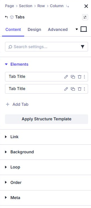
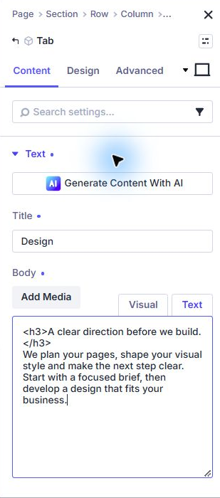
In the Tabs module’s Content → Elements area, use the pencil beside a Tab item to edit it. Enter its short title and its body content. Use the back arrow to return to the parent module, then edit the next item.
Add a third Tab item if needed. Rename the three items Design, Build and Care. Delete unused starter items so visitors never see placeholder titles.
For Design, explain the planning and visual direction. For Build, describe what the visitor receives and how the work is delivered. For Care, explain ongoing support. Use an ordinary link inside a panel only when it has a useful destination.
Make the selected tab unmistakable
Return to the parent Tabs module and open Design. Use Body Text for the reading text, Tab Text for inactive labels and Active Tab Text for the selected label.
Try this simple palette: warm cream panel #FCFAF4, dark teal text #123B38, pale teal inactive tabs #E7F3EC, and dark teal active background with white active text. These are suggested design values, not Divi defaults.
Start around 17–18px for body text on desktop and 16px on phone. Use a comfortable line height near 1.6. Add breathing room through the module’s Spacing controls. Avoid fixed heights: different panel copy needs room to grow.
Use a border or weight change as well as color to help distinguish the selected state. Test hover and keyboard focus separately; a pretty active tab does not prove the focus state is visible.
Check every panel on a narrow screen
Use Divi’s responsive controls to inspect tablet and phone. Shorten labels that wrap awkwardly and reduce excessive padding before shrinking the text. Tab arrangements can change with the available width, so inspect your actual layout.
Click each tab and look at the longest paragraph, longest link and any image. Make images flexible and give them appropriate alternative text. Avoid essential text embedded only in an image.
Keep the surrounding page stable enough that visitors can follow it. If a tall panel pushes the next section far down, shorten the content or make ordinary visible sections instead.
Save, then test the real page
Save the page, exit the builder and open its normal frontend URL. Click all three tabs in both directions and confirm the body changes to the matching content. Reload and check the initial panel too.
- No starter titles or filler paragraphs remain.
- Every panel is readable on desktop and a real phone.
- Tab labels remain readable in inactive, active and hover states.
- Try Tab, Shift+Tab, Enter/Space and arrow keys; verify what your installed module supports.
- Check that keyboard users can identify and operate the controls, and that assistive technology identifies the selected panel appropriately.
- Follow each content link and check its destination.
If the native ta