DRT HOW 2s / DIVI 5 & WORDPRESS TUTORIALS
BUILD IT · HOW 2 #06
A clear next step.
Every time.
How to style reusable buttons in Divi 5: descriptive links, readable hover states and a named preset you can apply across your website.
step obvious.Color · spacing · readable states
→
One familiar feel.
WHAT YOU’LL BUILD
One button style you can use with confidence.
Build a primary button, check its interaction states, then reuse the styling on a second button without losing the purpose of each link.
You need: WordPress with Divi 5, a draft or staging page and two real destination pages. Test shared presets away from your public site first.
Choose the action before choosing the color
Build on a draft or staging page. Add a regular section, a row and Divi’s native Button module. In Content → Text, replace “Click Here” with an action someone can understand before selecting it: “Explore our services,” “See the collection” or “Request a quote.”
In Content → Link, enter the actual destination and choose whether it opens in the same window. Keep ordinary links within your website in the same tab. A quote button should lead to your quote form; it does not create a form or send an enquiry by itself.
Use different labels when destinations differ. A whole page of identical “Learn more” buttons makes visitors work harder to decide what each one does.
Build a readable base style
Open Design → Button. Its Background, Border, Text, Icon and Sizing groups control the button itself. Start with one strong, simple combination: dark teal #123B38, white text, a modest 8px corner radius and text around 17px. These are suggested values; compare them with your own brand.
Add room around the label through the appropriate spacing controls. Aim for a comfortably tappable button rather than squeezing the words into a narrow badge. A 48px overall height is a useful starting target, not a claim that every label fits at that height.
Use an icon only when it adds meaning. The arrow in our example is decorative; the label still explains the action. If you use Divi’s icon settings, inspect both the resting and hovered button so the text does not jump unexpectedly.
Give hover and keyboard focus a clear job
Use Divi’s responsive/state controls for the button background and text color. The Responsive Editor exposes the available device and interaction states for each supported setting. Set the normal pair first, then inspect the Hover values together.
For this example, make the hovered background lime #D8F07B and the text dark teal #123B38. Leave enough contrast in both states. Do not change only the background and accidentally keep white text on a pale color.
Keyboard focus needs its own visible indication. Keep the browser’s focus outline, or deliberately style an equally clear focus state using the controls your version supports. Test the actual button with Tab and Shift+Tab. Hovering with a mouse does not test keyboard access.
Do not put essential information in a hover-only effect: phone visitors may never see it. Keep motion subtle and let the label remain readable without animation.
Save the style as a named Button preset
When the example looks right, open the preset icon beside Button at the top of its settings panel. Choose New Preset From Current Styles, give it a meaningful name such as Primary / Dark Teal, and save the preset.
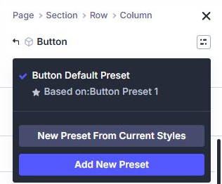
Apply that named preset to another native Button module. Give the second button its own label and destination, then check the result. Think of the preset as the shared design and the individual button as a specific next step.
You do not need to mark this as the site’s default preset to use it. Leave the default alone while learning: changing a shared default can affect many buttons beyond this draft.
Make one shared change, then check the exceptions
Presets remain connected. Editing the named preset updates the elements that use it, subject to local overrides and other applied presets. A local styling change on one button is different from editing the preset itself.
On your staging example, edit the named preset and make a small border-radius adjustment. Save the preset, then inspect both buttons. If one looks different, check its local modified settings and any additional presets before adding more overrides.
Create a separate outline or secondary preset when a different visual role is intentional. Do not overwrite the primary style just to make one less prominent action. Keep your preset names specific enough to recognize later.
Test the real links and the smallest layout
- Save the page and test its frontend outside the Visual Builder.
- Open both destinations and confirm the labels match the r