DRT HOW 2s / DIVI 5 & WORDPRESS TUTORIALS
BUILD IT · HOW 2 #07
Three services.
Room to breathe.
How to build responsive service cards in Divi 5, with proper padding, aligned actions and a phone layout that stays easy to read.
Room to compare.
→
card at a time.Same content. Comfortable reading.
WHAT YOU’LL BUILD
A service section that feels finished.
Build three cards with matching structure and intentionally different description lengths. Keep the actions aligned on desktop, then stack the cards in a sensible phone order.
You need: WordPress with Divi 5, a draft or staging page, three short service descriptions and real destination pages. The screenshots show actual row and column settings on Testing.
Plan three cards with the same content pattern
Use a draft page or a staging copy. Write three services before opening the styling controls. Each card needs a short heading, a useful description and one clear next step. Design, Build and Improve are our example labels; use your actual services.
Keep the pattern consistent even when the descriptions differ in length. Choose a sensible reading order, because that will become the phone order. An icon is optional. It should support the heading rather than replace it.
Give each action a real destination. These cards are ordinary page content: they do not become a searchable catalog, booking system or WooCommerce product list simply because they look like cards.
Create a row with three equal columns
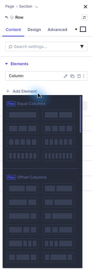
In Divi 5, add a regular section and a new row with three equal columns. You can inspect the row’s Content → Elements → Apply Structure Template choices to see the available arrangements. Start with a new row so you are not unexpectedly redistributing an existing design.
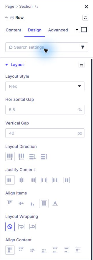
Open Row → Design → Layout and confirm Flex is the Layout Style. Set a consistent Horizontal Gap and Vertical Gap. Around 24px is a useful starting point; adjust for your row width and typography.
Use the gap controls for space between cards. Do not imitate a gap by inserting empty modules or adding a different outside margin to every card.
Put the breathing room inside each card
Treat each column as the card container. Give it a light background, a subtle border and a modest corner radius. In Column → Design → Spacing, add padding on all four sides. Try 28px on desktop and 22px on phone, then judge the actual result.
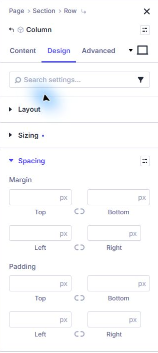
Padding belongs on the element carrying the card’s background. Adding padding only to the row leaves the card’s own heading pressed against its border. This is the distinction that makes the finished cards feel comfortable.
Inside the column, place a Group for the optional icon, heading and description, followed by a separate Button module. Keep the top content in that Group so the column has two main children: content and action.
Align the cards without fixed heights
On the parent row, use Design → Layout → Align Items → Stretch to let the columns share the available height on the same line. In each card column, use a vertical Column layout direction and Justify Content → Space Between.
With the Group at the top and Button at the bottom, different paragraph lengths can still produce a calm row of actions. Leave a useful Vertical Gap so the button never touches the paragraph.
Avoid forcing every card to a fixed pixel height. A longer title, increased browser text size or translated label can need extra room. Let the content determine the height, then use alignment to organize the space.
Stack the design before shrinking the words
Use Divi’s device selector to inspect Tablet and Phone. At a breakpoint where the cards feel cramped, change the row structure to fewer columns through its Elements controls. A three-column desktop arrangement and single-column phone arrangement are a clear starting point.
Inspect the individual column sizing too. If a card retains a narrow column class or fixed width, correct that at the selected breakpoint. Do not assume changing one container se