DRT HOW 2s / DIVI 5 & WORDPRESS TUTORIALS
BUILD IT · HOW 2 #11
A strong opening.
At every screen size.
Build a responsive two-column hero in Divi 5 with clear copy, an image, a useful button and a phone-friendly stacked layout.
→
WHAT YOU’LL BUILD
Make the first screen useful.
Create a simple opening section with a headline and action beside an image. On smaller screens, the copy comes first and the image follows. We will use normal layout flow rather than forcing everything into a fixed-height box.
You need: Divi 5, a draft page, a suitable image and one destination for the main button.
Write the message before styling
Choose one job for the hero: explain the offer and show the next step. Start with a headline such as “Thoughtful websites for growing businesses,” a short supporting paragraph and a “Discuss your project” button.
Use one H1 for the page’s main heading. Add an image that supports the message rather than repeating the same words inside a graphic. Keep important text as editable modules.
Build a two-column structure
Add a regular Section and a two-column Row. Put a Heading, Text and Button in the first Column and an Image in the second. Keep this reading order in Layers so the mobile stack makes sense without rearranging content visually.
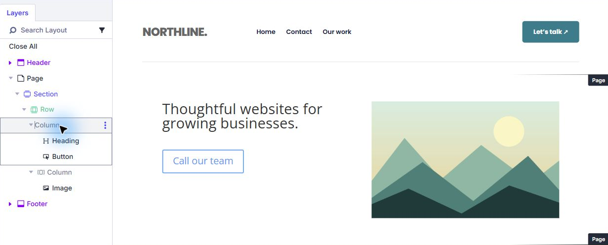
Give the Row a sensible width, such as 90%, and a maximum width around 1200px. In its Flex layout, allow a comfortable gap between Columns and align the content vertically to the middle. Keep the Section background separate from the text modules.
Use flexible spacing and proportionate type
Start with Section top and bottom padding around 72px on Desktop and reduce it at smaller breakpoints if needed. Keep the hero height automatic. A fixed height can clip a wrapped heading or push the action off screen when visitors enlarge text.
For a starting point, try a 56px headline on Desktop, 42px on Tablet and 34px on Phone, with a tight but readable line height around 1.15. These are design choices, not required Divi defaults. Adjust for your actual words and font.
Use a real Image module with an appropriate aspect ratio. Set its width to fill its column and keep its height proportional. Avoid stretching a portrait into a landscape box.
Give each breakpoint its own check
Choose Tablet and Phone in the Builder’s responsive controls. Make both Columns full-width at the breakpoint where side-by-side content becomes cramped. In a Flex row, the Fullwidth Column Class lets the columns form a single stack when wrapping is enabled.
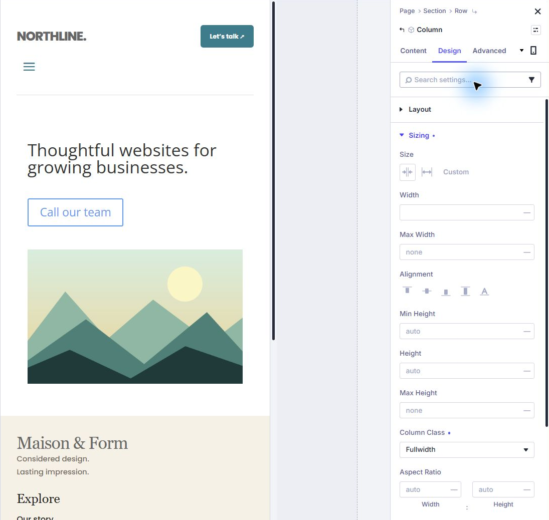
Confirm the copy comes before the image. Reduce large gaps and padding, but leave breathing room around the button. A taller mobile hero is acceptable; hiding essential information just to force it into one screen is not.
Check the saved page beyond the preview
Save, exit Divi and resize the browser gradually, including widths between the named breakpoints. Then check a real phone. Builder previews help you design, but they do not replace a real-device check.
- The headline explains the offer without a graphic containing essential text.
- The main button is visible, readable and leads to the intended page or section.
- Text and image do not overlap at intermediate widths.
- The copy appears before the image on mobile.
- Enlarging text does not clip the hero inside a fixed height.
- The image has useful alt text when it adds meaning.
Build on this: Link the hero button to a section on the page ↗
YOU’VE BUILT IT
A clear message before the scroll.
Keep the opening focused, then let the rest of the page answer the visitor’s next questions. Save the finished Section to your Library when it is ready to reuse.
References & notes
Written for Divi 5. Check the features available in your installed release; labels can change. Editor screenshots show actual controls on our Testing site. Diagrams are explanatory illustrations.
Published November 14, 2026 · By Divi Ready Themes · Independent of Elegant Themes.